For this project the assignment of a word was designated for each box. I chose energy, confidence and informational. The pink gridded box convey's energy with it's bright colors and intertwining handwritten type and computer generated text. The idea shows energy through the grid and proves that through the organization of letterforms the energy is conveyed neatly.
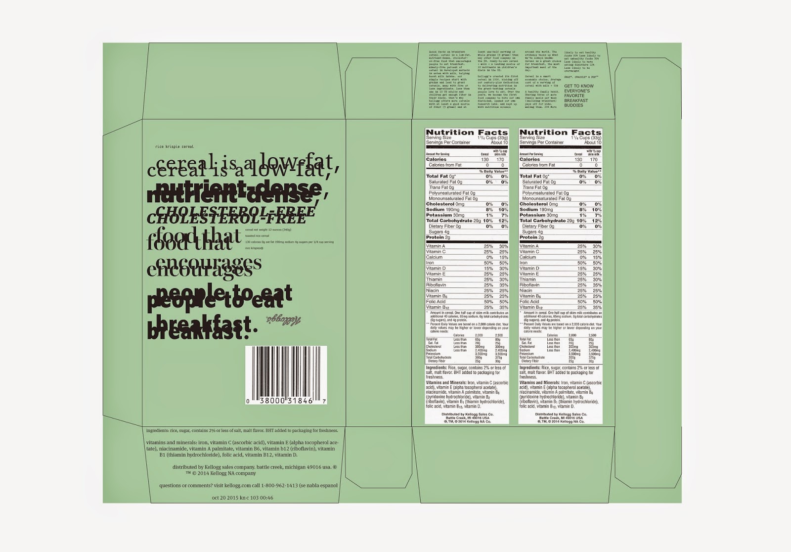
The second box, the pale blue and yellow, convey's information. This simplistic but chaotic form tricks the mind into believing that the information you are to absorb comes from the front. This is purely to then draw attention to the structure of the information on the back and allow the reader a seamless transition from point to point. This is the box that I would propose to a client. I feel this box is the most unconventional and non-cereal box like, but that's what I love about it.
The third box, convey's confidence. The way that the dark blue/black form has woven type and a gradient of typeface sizes the box itches for attention, therefore exuding confidence. The box, though simplistic on the front, shows its confidence through the changing paragraph forms and the vertical type.


The detailed shots of this box show the small copy and how the reader could potential decipher the text on the front, but then move to the back of the box to see the type in an orderly fashion and informationally laid out.